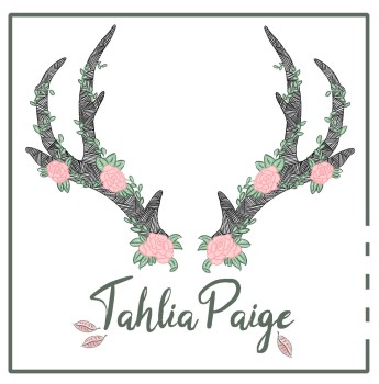
My logo is a massive part of my identity as a designer, I want it to reflect my interests and my strengths, but also be recognisable and versatile whether I am using it on my pattern designs or selling it on small handmade products.

This was the design I created initially, using my pattern work in the antlers and a rose at the end to finish the design and to add the nature elements to my designs. The feedback on this however was that it was quite masculine and stark compared to the pretty, light designs I do for patterns. I thought I wanted to do with the natural brown background, however again this appears to darken the design when actually through my patterns I have shown that my motifs on white do work quite well.

So with the feedback, I decided to try and feminise the antlers, by adding more flowers around it I think these do look a lot prettier with a big of colour injected into the design too. I also tried a far simpler leaf approach, which I like but I think the antlers does show more of me, it shows my patternwork and my motifs, combinging the two styles of artwork that I love to do.
I did an Instagram poll to my followers for an opinion on this, there was a 70% preference to the antler design, including fellow designers. I think this is important as it would be the audience that would see my logo. I think I will try to print this out to see how it looks on different sizes too, as this is important on a small scale business card, which would determine whether the design needed to be simplified.

